|
Colouring on old prints & maps
(for Cleaning see end of this page)
In my catalogues I have described coloured maps & prints using -
'original colouring' - any item that I feel has original hand colour, the same for colour that I feel was applied very soon after the map's publication.
'old colouring' - means the colour is old, but not original. For example the item may be 200 years old but the colour could possibly be 100 years old.
'recent colour' - the colour is recent, it may have been applied very recently or sometime earlier this century. Usually recently applied colour is in the style of old colouring, the process of colouring has not changed a great deal except for the use of more modern paints. When it is not easy to tell the age of colouring I use this description.
The issue of originality of colouring can be confusing, vague and contentious, especially when it comes to maps. Some collectors prefer maps in their original, often uncoloured state, as issued. On the other hand, there are others who follow the argument that maps as decorative items look more attractive coloured, and that if the colouring is well done it detracts nothing from the value of the map. In the end it is up to the individual to decide.
Below I have given some brief information on colouring and how I describe colouring in my catalogues.
Maps
Before the nineteenth century maps were usually published uncoloured. However, there were some exceptions, such as those published by the Bleaus which were coloured by their own in-house colourists.
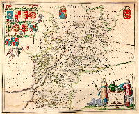 This is a Bleau map of Gloucestershire dating from about 1654 with original hand colouring as published. Most maps were coloured using watercolour, following more or less standardised colours which are still applicable today, such as brown for hills, red for cities and larger towns, blue for water, green for woods etc. Fig1 - detail of part of this map (Forest of Dean area) showing how the colours were applied to wooded areas and borders. Fig2 - more detail showing the colour as applied to one of the shields and cherubs.
During the sixteenth and seventeenth centuries map colouring was recognised as a trade in its own right, effectively being a continuation of the work of the illuminator. Some of the more elaborately coloured maps were superbly coloured and highlighted with gold paint.
Also, some maps and atlases normally published uncoloured had colour added when purchased as an option ('available coloured or plain'), or as a special commission by their first owner, this colouring could vary greatly in quality between superb and, to our eyes, awful.
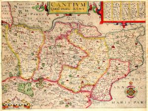 This 'Saxton/Kip' map of Kent from the 1607 edition of Camden's Britannia has fine early colour probably applied at or soon after publishing. Fig3 - detail showing the colour applied to the compass, the hundred boundaries and red for the settlements. This 'Saxton/Kip' map of Kent from the 1607 edition of Camden's Britannia has fine early colour probably applied at or soon after publishing. Fig3 - detail showing the colour applied to the compass, the hundred boundaries and red for the settlements.
During the nineteenth century it became more common for maps to be published with hand colour albeit of varying degrees of quality. Some may have had very simple outline colour applied and others may have had full wash colour over much of the image area.
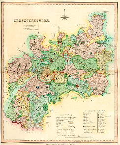 This county map of Gloucestershire, published by Henry Teesdale in 1829, exhibits full original wash hand colour as issued. Differing colours are used to show the hundreds, also private parks are shown in green, mail coach roads in sienna and main settlements in red. Fig4 - this shows the colouring in more detail. This county map of Gloucestershire, published by Henry Teesdale in 1829, exhibits full original wash hand colour as issued. Differing colours are used to show the hundreds, also private parks are shown in green, mail coach roads in sienna and main settlements in red. Fig4 - this shows the colouring in more detail.
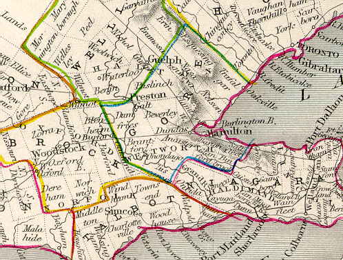 To the left is an enlarged portion of 'West Canada' from Tallis's Illustrated Atlas of 1850. This is a good example of original simple line colour as applied during the mid nineteenth century to many maps. This would have been much cheaper and simpler to apply than the full wash colour as used on the Gloucestershire Teesdale above, although it can sometimes have the appearance of being applied by felt-tip pen! To the left is an enlarged portion of 'West Canada' from Tallis's Illustrated Atlas of 1850. This is a good example of original simple line colour as applied during the mid nineteenth century to many maps. This would have been much cheaper and simpler to apply than the full wash colour as used on the Gloucestershire Teesdale above, although it can sometimes have the appearance of being applied by felt-tip pen!
With the advent of reasonably cheap colour printing (chromolithography), during the 1860's, hand colouring became less common. Some maps, such as the British Ordnance Survey series, printed from steel or copper plates did still have hand colour applied on occasions into the 20th century.
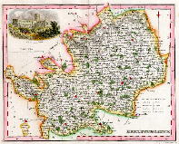 To the left is a county map of Hertfordshire published by A. Fullarton in 1833. This map has modern hand colour applied by a professional colourist. The style and colours applied are not very different to those used in the past, rendering a fairly plain county map into a far more attractive and decorative item. Fig 5 - detail of part of the map. To the left is a county map of Hertfordshire published by A. Fullarton in 1833. This map has modern hand colour applied by a professional colourist. The style and colours applied are not very different to those used in the past, rendering a fairly plain county map into a far more attractive and decorative item. Fig 5 - detail of part of the map.
Prints
Most wood cuts and wood, copper and steel engravings were published uncoloured. There were exceptions - often botanical and fashion plates were hand coloured when published. Sometimes topographical prints not normally coloured would have colouring added as an 'extra' by the publisher, this option would usually add considerably to the cost so was not commonly taken up. Also the first owner may have had colour added as a special commission. Certain types of print, such as aquatints and lithographs were more commonly hand coloured when published. Some of the series of large topographical aquatints were works of art in their own right.
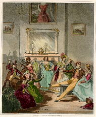 'The Life of a Nobleman, Scene the Third, The Night House'. A fine aquatint engraved and printed by G. Dawe in London, around 1820, with full original hand colour. Publications of this kind, especially those with large plates tended to be very expensive, and still are, due to the quality of engraving and colouring. Fig 6- enlarged detail, note the colour applied to the flowers in the woman's hair. 'The Life of a Nobleman, Scene the Third, The Night House'. A fine aquatint engraved and printed by G. Dawe in London, around 1820, with full original hand colour. Publications of this kind, especially those with large plates tended to be very expensive, and still are, due to the quality of engraving and colouring. Fig 6- enlarged detail, note the colour applied to the flowers in the woman's hair.
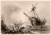 This is a steel
engraved print published in 1841 (showing a ship beached near
Margate, Kent) in it's original uncoloured state. Fig
7- detail of part of the print. This is a steel
engraved print published in 1841 (showing a ship beached near
Margate, Kent) in it's original uncoloured state. Fig
7- detail of part of the print.
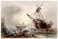 The same print
with recent hand colouring applied, with Fig
8- detail of the same part of the image. The style and technique
of colouring used on this print by a professional colourist is
very similar to that used in the past. One of these prints with
original colour (scarce) would have a very similar appearance. The same print
with recent hand colouring applied, with Fig
8- detail of the same part of the image. The style and technique
of colouring used on this print by a professional colourist is
very similar to that used in the past. One of these prints with
original colour (scarce) would have a very similar appearance.
Cleaning
Sometimes prints or maps offered may have been cleaned. This is standard practice when a map or print has become dirty or foxed, or has been treated poorly in the past - such as having been repaired using sticky tape.
|
|
Example of a steel engraved print dating from 1840 with severe foxing. |
The same print after cleaning,
restored to it's original appearance. |
Cleaning is normally carried out using a special type of bleach which is then rinsed out. Certain types of more expensive maps and prints (such as very early maps or scarce coloured lithographs) can sometimes be cleaned using special processes and solvents over a vacuum table. Properly carried out cleaning will not adversely affect the condition of a map or print and can save it from further deterioration.
As cleaning is a common practice I do not normally state if a print or map has been cleaned in my catalogues. |


